|
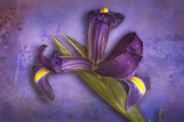
At the other extreme, in images we think of as fine art, if you make the image stunning, they require no information to simply enjoy. This is an iris from SCU faculty member Bob Coates and his fine art collection. by Scott Bourne In the dim recesses of my mind there’s the memory of a Joan Collins made-for-TV movie that was every bit as bad as the proper noun promises. I’m judging the whole thing by the one scene I saw: it began with a classic establishing shot of the Eiffel Tower and then, helpfully, a caption faded in. “PARIS.” Yeah. I know. Still — and here I’m gamely searching for something nice to say — it leaves absolutely no doubt as to where we are. In travel and tourist photography, that’s often pretty important. Mind you, I’m not saying that Ansel Adams’ classic photos of Half Dome would have been better if he’d managed to frame it so that a “Welcome To Yellowstone…Please Dispose Of Litter Thoughtfully” trash barrel had been in the foreground somewhere. Heaven forbid. But sometimes, it’s completely appropriate. It’s information that the viewer wants to have, whether it’s conveyed as explicitly as a street sign or as subtly as the type of bus in the background. Choose a slightly more thoughtful angle, and it’s no longer “a photo of two women having coffee at any coffee shop anywhere in the world” but “…in London, somewhere in Soho.” This post from my buddy Scott, got me thinking about one of the most ignored challenges in print competition regarding information, the title. Over the years I've seen so many images that might have scored just a little better had the photographer taken time to work on the title of the image and given people more information. Here's the challenge that's missed. A great title helps to lead the judges down the right path before they even see the image. It enhances the image just as much as those adjustments you made in the camera or the computer to give it more impact. There it is, the magic word - "impact". That's the most important quality of every image you enter in competition and without impact it's just another print. It's the equivalent of that can of soda left out over night. It's got color, flavor just no fizz. So, the next time you enter any images in competition, think about the title. Spend a little time and use a few words to create a title to really make that print truly special. Give the judges a sneak peek into the passion you have as an artist instead of just calling it "Paris". by Skip Cohen
0 Comments
Leave a Reply. |
Our Partners"Why?"Check out "Why?" one of the most popular features on the SCU Blog. It's a very simple concept - one image, one artist and one short sound bite. Each artist shares what makes the image one of their most favorite. We're over 100 artists featured since the project started. Click on the link above and you can scroll through all of the episodes to date.
Categories
All
|
© 2019 Skip Cohen University


 RSS Feed


