|
by Skip Cohen
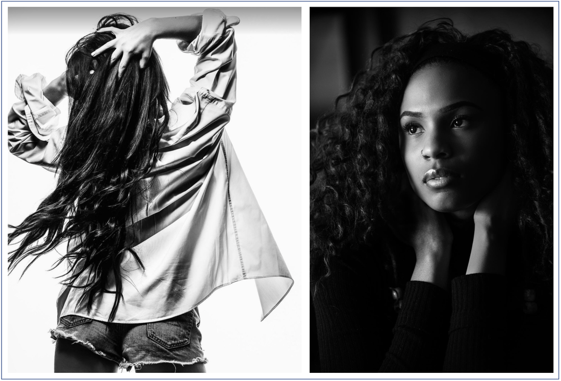
As I've written so many times before, the fun of this industry is in the friendships. Well, meet Erik Cooper. Erik and I met when I was wearing my Platypod hat. He was a new member of PPA, and at the time, there was a new-member benefit to receive a Platypod. What started as a purely customer service phone conversation has grown into a great friendship, multiple calls, and finally catching up to each other LIVE at ClickCon last year. Erik is a fashion and portrait photographer, although I doubt there's anything he can't photograph. He's based in Colorado Springs. We're a perfect example of how Facebook is sometimes the mortar that holds so many friendships together, especially during a time of limited conventions and travel - combine social media with a phone and it's easy to stay in touch. Meanwhile, today's post isn't about Erik but the importance of understanding great lighting. Whenever I hear an artist say, "I'm a natural light specialist," right from the start, I know they're afraid of studio lighting. They've never taken the time to learn lighting and expand their skill set. The truth is, all of us love natural light, and that's what understanding studio lighting is all about - creating stunning photographs with whatever light source you have! But there's another point to today's post - a reminder of the power of a black and white image, especially in portrait work. Bringing a few black and white images into your portfolio/galleries also shows diversity in your skill set. Learn to see in B&W. It's about your thought process from the beginning and learning to see the highlights and shadows in your mind as you create and capture the portrait. And for on-location wedding and event photographers, B&W also gives you more creativity in tough situations. For example, one of the early books I co-authored was with Bambi Cantrell. In the book she talked about shooting B&W when you're photographing in "the First Church of Uglyville!" We even did a stunning bridal portrait in the restroom at a hotel. It was shot in B&W, and was stunning, hiding the ugly deep pink tile walls! A big thanks to Erik for sharing these images with me, and if you'd like to see more of his work, his Instagram page is just a click away.
0 Comments
Your comment will be posted after it is approved.
Leave a Reply. |
Our Partners"Why?"Check out "Why?" one of the most popular features on the SCU Blog. It's a very simple concept - one image, one artist and one short sound bite. Each artist shares what makes the image one of their most favorite. We're over 100 artists featured since the project started. Click on the link above and you can scroll through all of the episodes to date.
Categories
All
|
© 2019 Skip Cohen University


 RSS Feed


